|
|||||||||
| PREV PACKAGE NEXT PACKAGE | FRAMES NO FRAMES | ||||||||

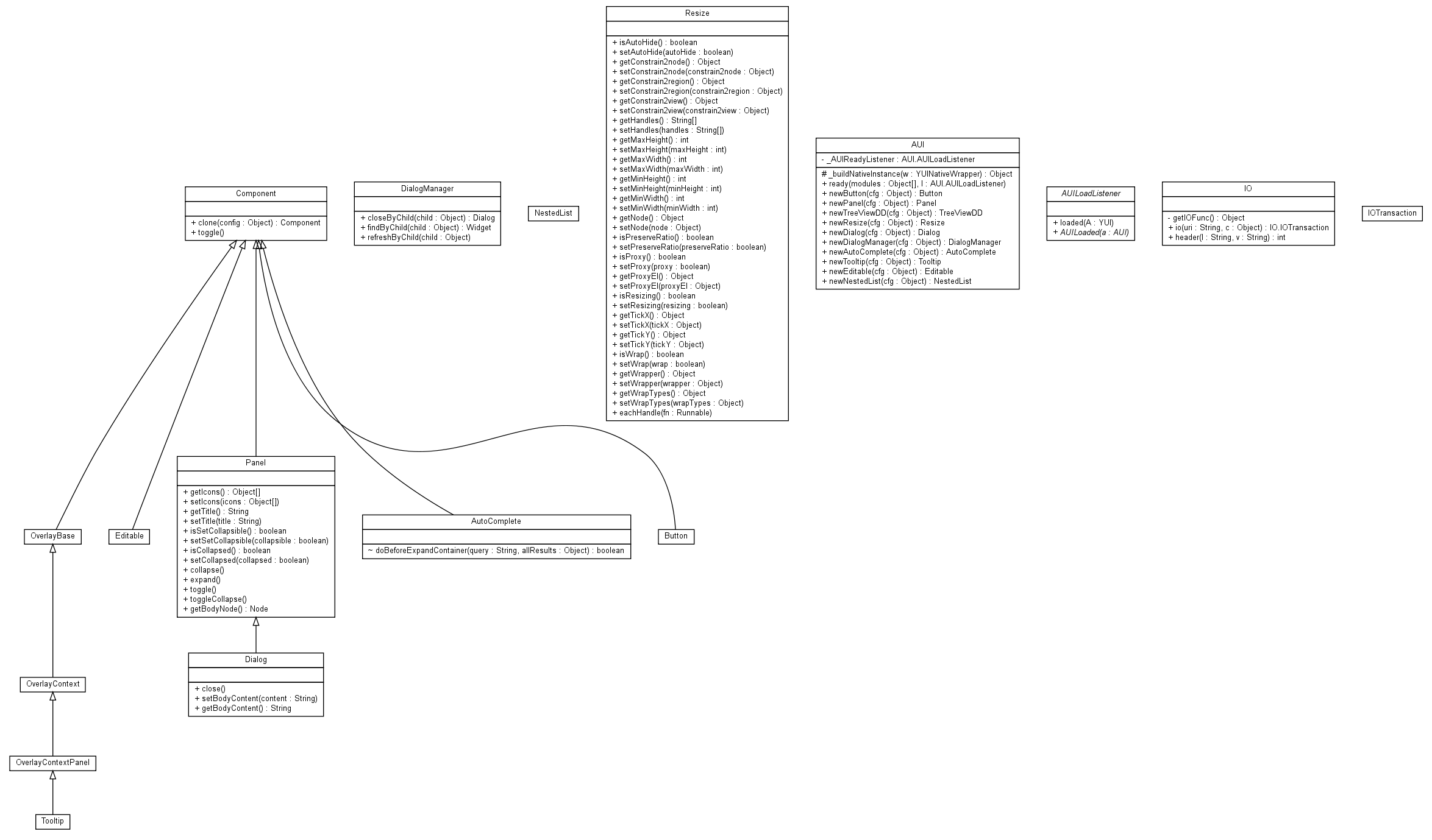
| Class Summary | |
|---|---|
| AUI | |
| AUI.AUILoadListener | |
| AutoComplete | A base class for AutoComplete, providing: Widget Lifecycle (initializer, renderUI, bindUI, syncUI, destructor) Presenting users choices based on their input Separating selected items Keyboard interaction for selecting items Quick Example: var instance = new A.AutoComplete({ dataSource: [['AL', 'Alabama', 'The Heart of Dixie'], ['AK', 'Alaska', 'The Land of the Midnight Sun'], ['AZ', 'Arizona', 'The Grand Canyon State']], schema: { resultFields: ['key', 'name', 'description'] }, matchKey: 'name', delimChar: ',', typeAhead: true, contentBox: '#myAutoComplete' }).render(); |
| Button | A base class for Button, providing: Widget Lifecycle (initializer, renderUI, bindUI, syncUI, destructor) An optional icon or label Managed user interaction states (default, active, hover) Keyboard accessible Quick Example: var instance = new A.Button({ icon: 'gear', label: 'Configuration' }).render(); |
| Component | http://alloy.liferay.com/deploy/api/Component.html A base class for Component, providing: Widget Lifecycle (initializer, renderUI, bindUI, syncUI, destructor) |
| Dialog | A base class for Dialog, providing: Widget Lifecycle (initializer, renderUI, bindUI, syncUI, destructor) Emulate the behavior of an dialog window using a floating, draggable HTML element Interface for easily gathering information from the user without leaving the underlying page context Using the IOPlugin, supports the submission of form data either through an XMLHttpRequest, through a normal form submission, or through a fully script-based response Quick Example: var instance = new A.Dialog({ bodyContent: 'Dialog body', centered: true, constrain2view: true, destroyOnClose: true, draggable: true, height: 250, resizable: false, stack: true, title: 'Dialog title', width: 500 }).render(); |
| DialogManager | A base class for DialogManager |
| Editable | A base class for Editable, providing: Widget Lifecycle (initializer, renderUI, bindUI, syncUI, destructor) Edit in place elements Quick Example: var instance = new A.Editable({ node: '#editor' }).render(); |
| IO | data==Y.io since all methods are static |
| IO.IOTransaction | the object returned but io() that represents an IO transaction |
| NestedList | A base class for NestedList, providing: Widget Lifecycle (initializer, renderUI, bindUI, syncUI, destructor) Nested sortable utility Quick Example: var nl = new A.NestedList({ nodes: '#demo li', dropContainer: 'ul.droppable' }); |
| OverlayBase | A basic Overlay Widget, which can be positioned based on Page XY co-ordinates and is stackable (z-index support). |
| OverlayContext | A base class for OverlayContext, providing: Widget Lifecycle (initializer, renderUI, bindUI, syncUI, destructor) Able to display an Overlay at a specified corner of an element trigger Quick Example: var instance = new A.OverlayContext({ boundingBox: '#OverlayBoundingBox', hideOn: 'mouseleave', showOn: 'mouseenter', trigger: '.menu-trigger' }).render(); |
| OverlayContextPanel | A base class for OverlayContextPanel, providing: Widget Lifecycle (initializer, renderUI, bindUI, syncUI, destructor) Customizable arrow Optional animation when show or hide Quick Example: var instance = new A.OverlayContextPanel({ bodyContent: 'Here s a sample OverlayContextPanel |
| Panel | The Panel Utility - Panel is a container that has specific functionality and structural components that make it the good for building block for application-oriented user interfaces. |
| Resize | A base class for Resize, providing: Basic Lifecycle (initializer, renderUI, bindUI, syncUI, destructor) Applies drag handles to an element to make it resizable Here is the list of valid resize handles: [ 't', 'tr', 'r', 'br', 'b', 'bl', 'l', 'tl' ]. |
| Tooltip | A base class for Tooltip, providing: Widget Lifecycle (initializer, renderUI, bindUI, syncUI, destructor) Additional information when hovering over a target element Quick Example: var instance = new A.Tooltip({ trigger: '#element', align: { points: [ 'lc', 'rc' ] }, bodyContent: 'Simple tooltip' }).render(); |
|
|||||||||
| PREV PACKAGE NEXT PACKAGE | FRAMES NO FRAMES | ||||||||